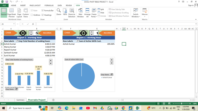
Employee Working Hours Analysis using Pivot Tables
Project Details
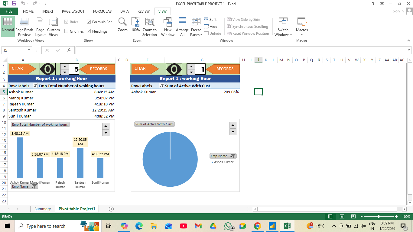
This project leverages Excel Pivot Tables and Charts to analyze employee working hours and customer activity metrics. Raw HR data was cleaned, structured, and summarized using pivot tables to calculate totals, averages, and percentages. Visualizations such as bar charts and pie charts were created to present insights clearly, enabling quick comparisons across employees. The dashboard highlights productivity trends, customer engagement levels, and performance variations. By combining pivot functionality with data visualization, the project demonstrates how Excel can transform operational data into actionable insights for HR managers, team leaders, and business analysts to support workforce decisions.
Skills
Tools
📊 Excel Pivot Table Project – Employee Working Hours & Activity Analysis
Managing workforce productivity requires clear insights into employee performance. This project leverages Excel Pivot Tables and Pivot Charts to transform raw data into meaningful reports, helping HR and management teams track working hours and customer activity metrics with ease.
🔍 Key Features
- Working Hours Report – Summarizes total hours logged by employees, visualized with bar charts.
- Customer Activity Metrics – Displays employee engagement with customers using percentage-based pivot analysis.
- Dynamic Pivot Tables – Flexible reporting that allows quick filtering, grouping, and aggregation of data.
- Interactive Charts – Bar and pie charts linked to pivot tables for clear visual storytelling.
🛠 Tools & Techniques
- Microsoft Excel – Core platform for data analysis.
- Pivot Tables – Summarizing and aggregating employee data.
- Pivot Charts – Visualizing working hours and activity metrics.
- Data Cleaning & Formatting – Preparing raw HR data for accurate reporting.
- Conditional Formatting – Highlighting key values for better readability.
🌟 Business Impact This project enables organizations to:
- Monitor employee working hours efficiently.
- Track customer engagement levels across staff.
- Identify productivity trends and areas for improvement.
- Present insights in a clear, visual format for decision-making.
👥 Target Audience
- HR Managers
- Team Leaders
- Business Analysts
- Operations Executives
By combining Excel’s powerful pivot features with visualization tools, this project demonstrates how simple spreadsheets can deliver actionable workforce insights.
Next Project
